The default canvas element
By default, browsers will create canvas elements with a width of 300px and a height of 150px

HTML:
<canvas
  id="nr-canvas-1"
  data-scrawl-canvas
></canvas>

Note that the blue oval uses relative ('n%' string) values to set its x and y radiuses, and changes its appearance in line with the canvas element's dimensions, whereas the green oval uses absolute (n number) values so is unaffected by changes in the canvas element's dimensions
The sized canvas element
We can set the canvas dimensions using the width and height attributes

HTML:
<canvas
  id="nr-canvas-2"
  width="300"
  height="300"
  data-scrawl-canvas
></canvas>
Canvas elements and CSS box-sizing
Canvas elements ignore all attempts to set their CSS box-sizing property to anything other than 'content-box'

CSS:
.padded-canvas {
  border: 24px dashed aqua;
  padding: 24px;
  background-color: teal;
  box-sizing: border-box;
}

HTML:
<canvas
  id="nr-canvas-3"
  class="padded-canvas"
  data-scrawl-canvas
></canvas>

Be aware: Scrawl-canvas will include the canvas border and padding values when calculating the dimensions of the canvas element's base cell, making it larger than the display canvas. This will have a effect on the displayed graphic - strokes, and some shapes, will look thinner/smaller than expected.

Pro-tip: if you really need your canvas to have a border, consider using CSS box shadows to create it.

canvas {
  box-shadow: 0px 0px 0px 1px black;
}
Sizing the canvas element using CSS
While Scrawl-canvas static canvases can be sized using CSS, this is not a recommended practice.

CSS:
.nr-canvas-css-dimensions {
  width: 600px;
  height: 200px;
}

HTML:
<canvas
  id="nr-canvas-4"
  class="nr-canvas-css-dimensions"
  data-scrawl-canvas
></canvas>
Sizing the canvas element using CSS (continued)
Attempts to use CSS to make the canvas element 'responsive' will not work on Scrawl-canvas canvases.

CSS:
.canvas-container {
  overflow: hidden;
  resize: both;
  border: 1px solid black;
  width: 400px;
  height: 400px;
  min-width: 200px;
  min-height: 200px;
  max-width: 800px;
  max-height: 800px;
}

.nr-canvas-css-relative {
  width: 100%;
  height: 100%;
}

HTML:
<div class="canvas-container">
  <canvas
    id="nr-canvas-5"
    class="nr-canvas-css-relative"
    data-scrawl-canvas
></canvas>
</div>
Make the canvas responsive using Scrawl-canvas
To make a canvas responsive, add the data-is-responsive="true" attribute to it

HTML:
<div class="canvas-container">
  <canvas
    id="canvas-1"
    data-scrawl-canvas
    data-is-responsive="true"
  ></canvas>
</div>
Emulate the CSS image-fit property
We can add additional data- attributes to the canvas element's markup to set the dimensions of its base cell, and determine how the base cell will fit into its display canvas

HTML:
<div class="canvas-container">
  <canvas
    id="canvas-2"
    data-scrawl-canvas
    data-is-responsive="true"
    data-base-width="400"
    data-base-height="400"
    data-fit="contain"
  ></canvas>
</div>

Scrawl-canvas supports the following data-fit values: "none" (the default); "cover"; "contain"; and "fill"
Defining a responsive image in HTML
Scrawl-canvas can use an image asset defined in an <img> element with a srcset attribute, and will update the image in line with browser updates in response to changes in their viewport widths.
HTML:
<div class="canvas-container">
<canvas
id="canvas-3"
data-scrawl-canvas
data-is-responsive="true"
data-base-width="800"
data-base-height="400"
data-fit="cover"
></canvas>
</div>
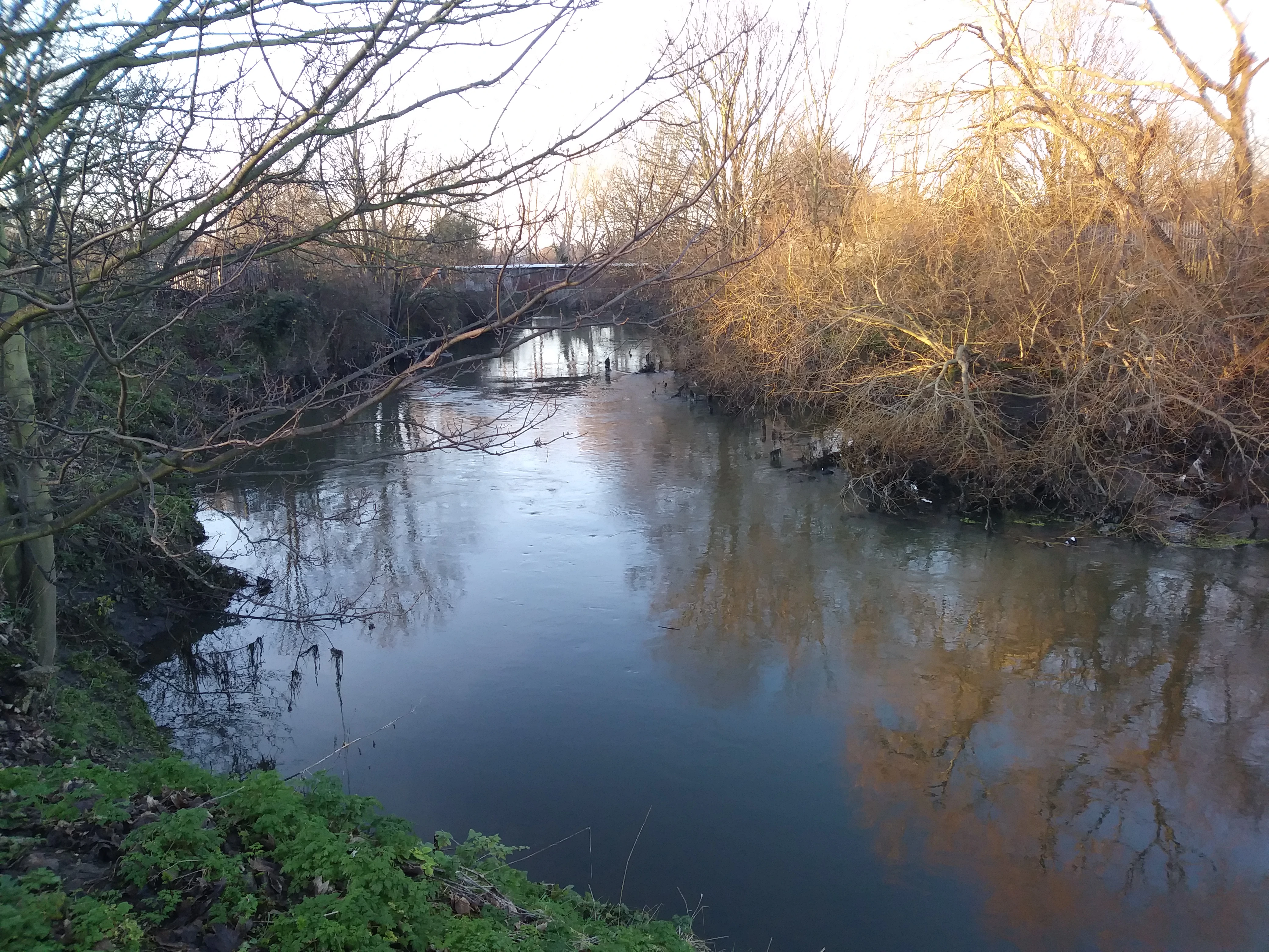
<img
id="river"
class="myimage"
alt="Image used in canvas element"
src="img/river.webp"
srcset="img/river-300.webp 300w,
img/river-600.webp 600w,
img/river-900.webp 900w,
img/river-1200.webp 1200w,
img/river-1600.webp 1600w,
img/river-2000.webp 2000w,
img/river-2400.webp 2400w,
img/river-2800.webp 2800w,
img/river-3200.webp 3200w,
img/river-3600.webp 3600w,
img/river-4000.webp 4000w"
data-dimensions='{
"river-300.webp": [300, 225],
"river-600.webp": [600, 450],
"river-900.webp": [900, 675],
"river-1200.webp": [1200, 900],
"river-1600.webp": [1600, 1200],
"river-2000.webp": [2000, 1500],
"river-2400.webp": [2400, 1800],
"river-2800.webp": [2800, 2100],
"river-3200.webp": [3200, 2400],
"river-3600.webp": [3600, 2700],
"river-4000.webp": [4000, 3000]
}'
/>
Javascript:
const canvas3 = scrawl.library.canvas['canvas-3'];
scrawl.importDomImage('.myimage');
scrawl.makePicture({
name: `${canvas3.name}-image`,
group: canvas3.base.name,
asset: "river",
width: "100%",
height: "100%",
copyWidth: "100%",
copyHeight: "100%"
});
To work correctly, we need to add some additional data to the element - specifically the intrinsic dimensions of each image defined in the srcset attribute, supplied as a JSON string of an object with the filename of each image as a key and an array of that image's width and height (in px) as the value to that key.
To note: Javascript is not running in this browser environment. Our apologies, but this demo has not yet been updated to support progressive enhancement.
Known issue: Webkit based browsers (for example: Safari) will load an appropriately sized image initially, but does not respond by uploading additional images as the browser dimensiopns change.
Known issue: Firefox browser will load new images on when viewport width both increases and decreases.
Touch test: not required (though some canvases should be resizable)